
Choosing the right paint color is only half the battle when designing or refreshing an interior space. Once the paint is applied, how it actually looks depends on more than just the pigment in the can. Lighting plays a crucial role in how a color is perceived, how the room feels, and how design features are either enhanced or diminished. Yet it is one of the most commonly overlooked factors in interior design and renovation projects.
Anyone who has painted a room only to find that the color looks nothing like the swatch they picked can attest to this. The truth is, paint is never seen in isolation. It is always filtered through light, whether natural or artificial. The warmth, intensity, direction, and source of that light will all dramatically influence how a painted surface appears throughout the day.
Understanding the relationship between lighting and interior paint is not just helpful, it is essential. When you account for lighting from the start, you set yourself up for a space that feels harmonious, intentional, and inviting at every hour.
The Science of Color and Light Interaction
To get a grasp on why lighting affects paint so much, it helps to think about what light actually is. Light is made up of waves of different lengths, and those wavelengths correspond to different colors. When light hits a painted wall, certain wavelengths are absorbed while others are reflected. The ones that are reflected are what your eyes perceive as color.
This means that the color of the light itself becomes part of the equation. For example, daylight contains a full spectrum of color and tends to show paint more accurately. Incandescent bulbs emit a warmer light with yellow and red tones, which can warm up a cool gray or make a white look creamy. Fluorescent lighting may have a green or blue cast, which can skew colors unexpectedly.
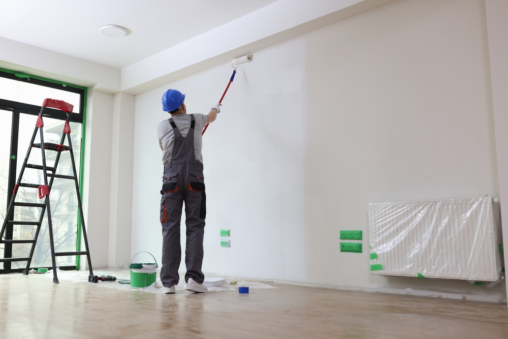
This is why paint often looks perfect in the store under commercial lighting, only to appear entirely different once applied at home. Utilizing the services of an interior painter in Willow Grove and the surrounding areas can simplify your decision regarding the sheen of the paint and can influence how much light is reflected, further altering the perception of color.
Natural Light and How It Changes Over Time
Natural light is the most dynamic source of illumination in any space. It shifts in intensity and temperature throughout the day and even varies with the seasons. Morning light tends to be cooler with a bluish tint, while late afternoon light has a warmer, golden quality. During winter months, the light may be softer and dimmer compared to the sharper brightness of summer.
The orientation of the room also matters. North-facing rooms typically receive indirect, consistent light that is cooler and can make colors appear more muted. South-facing rooms get the most daylight throughout the day, which brings out the richness in most hues. East-facing rooms are flooded with cool, bright light in the morning but tend to darken in the afternoon. West-facing rooms are the opposite, often feeling dim early and glowing warmly later in the day.
All of this variation means that a single paint color will never look the same at all times. When selecting a paint color, it is important to test large swatches on different walls and to view them at multiple times throughout the day. This will help ensure that you are happy with how the color reads, regardless of the time or lighting condition.
Artificial Light Sources and Their Effects
Once the sun goes down, artificial lighting takes over. The type of artificial lighting used in a space can have just as much influence on painted surfaces as natural light, if not more. Not all bulbs are created equal, and each one can drastically affect the appearance of a painted wall or ceiling.
Incandescent Lighting: The type of lighting emits a warm, yellowish light that can enhance warm tones but may dull cooler colors. A blue-gray may look more beige under incandescent lighting, while whites can appear soft and golden. These bulbs are common in older homes and traditional spaces.
LED Lights: LED lights, which are widely used today, come in a range of color temperatures. “Warm white” LEDs can mimic incandescent lighting, while “cool white” or “daylight” LEDs produce a brighter, whiter light. Depending on the paint color, this can either enhance or distort the visual effect. For example, a soft green may feel clean and airy under cool LEDs, but harsh or sterile if the color temperature is too high.
Fluorescent Lighting: Fluorescent lighting often casts a blue or green tint and is most commonly used in commercial or utilitarian settings. It tends to wash out colors and can emphasize undertones in a way that surprises people. Even subtle beige tones can turn pinkish or gray under fluorescent light.
To get the best results, make lighting decisions alongside color decisions. Pay attention to the type of bulbs you are using, their placement, and their intensity. Lighting should support the overall design, not fight against it.
Paint Finishes and Light Reflection
Another element that influences how light interacts with paint is the finish. The same paint color will look very different in a flat finish compared to a high gloss. That is because sheen affects how much light is reflected off the surface.
Flat and Matte Finishes: These finishes absorb more light, making them ideal for hiding wall imperfections and creating a soft, understated look. These are great for ceilings, master bedrooms, or spaces where a subtle visual effect is desired. However, in very dim rooms, matte finishes may make colors appear darker than expected.
Eggshell and Satin Finishes: Eggshell and satin provide a slight sheen and reflect more light than matte options. They strike a good balance between subtle and reflective, making them suitable for living rooms, dining rooms, and hallways. They are also easier to clean, which is an added benefit.
Semi-Gloss and Gloss Finishes: Finishes like these can reflect a lot of light, highlighting details and drawing attention to trim, doors, and cabinetry. These finishes are excellent for showcasing architectural elements, but they can also accentuate flaws if the surface is not perfectly smooth.
When considering finishes, take into account the lighting in the room. A high-sheen finish in a brightly lit area can feel too intense, while the same finish in a darker room can add necessary vibrancy. A professional, residential painter in Collegeville can help you decide what finish is appropriate based on the space and the regular lighting it receives.
Strategic Lighting to Showcase Paint
Once the paint has been applied, lighting becomes a tool to either emphasize or soften the result. A well-lit room brings color to life, draws the eye to intentional focal points, and allows painted features to perform as designed.
Use directional lighting such as track lights or sconces to highlight an accent wall or a painted alcove. Install under-cabinet lighting in kitchens to illuminate freshly painted cabinets and backsplashes. Table lamps and floor lamps add warmth and softness, helping colors feel cozy and layered.
Consider the placement of overhead fixtures, especially in open-concept rooms. One section of a room may be washed in warm light, while another remains in shadow, causing inconsistencies in how the color looks. This can be corrected with balanced lighting throughout.
Even dimmer switches play a valuable role. Being able to adjust the intensity of artificial light lets you control how much the color shifts throughout the evening, enhancing both comfort and visual harmony.
Color Testing in Real-World Conditions
Too many people rely solely on a paint chip or a color preview app before making their final decision. While these tools are helpful, nothing compares to testing paint in the actual environment where it will live.
Apply generous samples to several walls in the room and observe how they look in the morning, at midday, and at night. View the colors under all the light sources you plan to use, including overhead lighting, lamps, and natural light from windows.
Doing this may reveal undertones or shifts that weren’t apparent in the store or on a small swatch. A beige that looked neutral might read pink in your bedroom. A green you thought was vibrant could appear too muted in your kitchen.
Taking this extra step ensures that your final decision is informed, confident, and unlikely to disappoint.
A Thoughtful Approach Makes All the Difference
Lighting and paint are two sides of the same design coin. One without the other leaves a space feeling incomplete or disconnected. When carefully considered together, they work in harmony to create rooms that feel balanced, intentional, and comfortable.
Bringing these elements into alignment requires more than just a good eye. It takes experience, attention to detail, and a commitment to quality. From selecting the right shade for a sun-drenched room to choosing the ideal finish for a softly lit hallway, these decisions matter.
At Proper Painting LLC, the connection between lighting and paint is part of every project. The team approaches each home and space with a focus on how color, finish, and light will work together from the start. They do not just apply paint. They elevate your entire interior by helping you choose options that look exceptional in every kind of light.
If you’re planning your next interior update, consider how lighting will influence your results. When you’re ready to bring your vision to life with expert guidance, contact Proper Painting to help you make every room look its best, at any time of day.