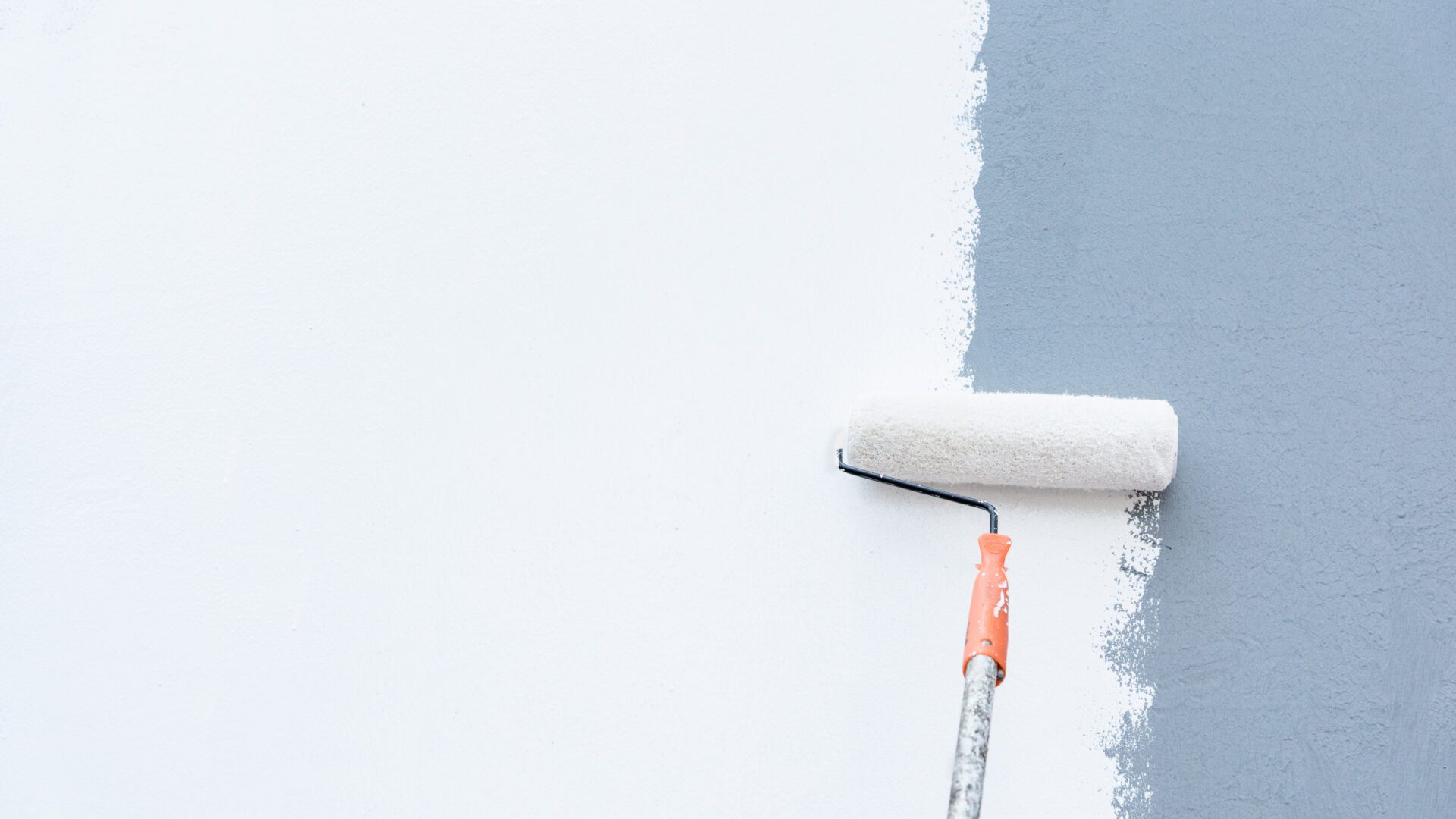
There’s a funny thing about painting a room white: it feels like the safest choice… until you live with it. What starts as “clean and crisp” can quickly become cold, sterile, and strangely lifeless. You wanted effortless elegance but ended up with something closer to a hospital hallway. If you’ve ever stared at a wall thinking it felt “off” but couldn’t explain why, you’re not alone.
That’s the risk of defaulting to white. While it’s long been the go-to neutral for clean, minimalist vibes, it can quickly cross the line into cold and clinical. However, you don’t have to abandon neutrality to avoid a flat, lifeless look.
There are countless alternatives to white that add warmth, depth, and personality without overpowering your space. That’s where better neutrals come in—those soft grays, muted taupes, and creamy earth tones that warm a room without overwhelming it.
Better neutrals don’t whisper; they hum with subtle energy. They’re quiet, but never boring. These hues offer enough pigment to define your space without boxing it in. They play well with natural light, enhance textures, and give furniture and décor the spotlight they deserve.
Most importantly, they feel lived-in from day one, unlike pure white, which often needs months of wear before it looks like home. If you’ve ever walked into a room and immediately felt a sense of calm, there’s a good chance a warm neutral was working its quiet magic behind the scenes.
Why White Isn’t Always Right
White walls have their place. They can open up a small room, bounce light beautifully, and provide a crisp backdrop for art or furniture. But in practice, white can be hard to live with. Every smudge, dent, or kid fingerprint becomes visible. And unless your lighting is consistently warm, some whites take on unwanted blue or gray tones that make a space feel sterile.
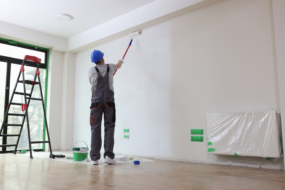
In short, white often lacks character. It can feel unfinished, especially in homes that need a bit more warmth or softness. That’s where a professional house painter in Perkasie, PA and better neutrals come in. These are colors that still keep things light, airy, and versatile, but with enough pigment to create mood, dimension, and comfort.
Neutrals also reduce the psychological pressure of perfection. White walls demand a spotless environment, and that can create subtle stress. Better neutrals are more forgiving—not just visually, but emotionally. They allow a space to feel relaxed, cozy, and lived-in without slipping into dullness.
The Case for Better Neutrals
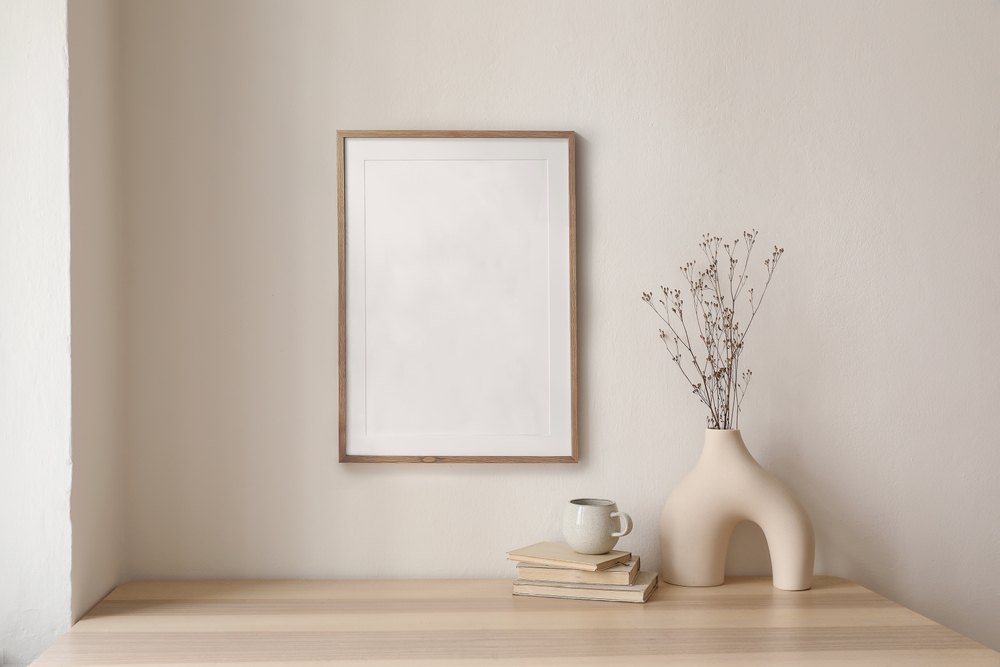
Neutrals have come a long way from the days of beige overload. Today’s soft tones offer a wide range of options that suit any aesthetic, from modern farmhouse to coastal chic. The best part? They’re endlessly layerable. Whether you’re pairing with bold furnishings or subtle textiles, these shades bring balance and subtle elegance to a room.
They’re also more forgiving. A slightly tinted neutral hides scuffs better than stark white, plays nicely with mixed metals and woods, and changes beautifully with the light throughout the day.
Even in open-concept spaces, better neutrals provide quiet continuity. They’re flexible enough to carry from the kitchen into the living area without jarring transitions. These hues offer cohesion without monotony, tying your entire home together in an organic, seamless way.
Top Alternatives to White for Your Walls
| Color Family | Popular Shade | Description | Best For |
| Soft Grays | Repose Gray | A versatile gray with warm undertones that doesn’t go blue | Living rooms, hallways |
| Taupes | Accessible Beige | A beige-gray hybrid that reads sophisticated, not dull | Bedrooms, entryways |
| Warm Neutrals | Edgecomb Gray | A creamy greige with subtle warmth | Open concept spaces |
| Greige | Classic Gray | An off-white with depth and softness | Kitchens, bathrooms |
| Earthy Tones | Pale Oak | Feels like stone or linen in color—subtle but textured | Dining rooms, studies |
These shades work particularly well for clients looking to update their space without committing to strong color. They’re calming, welcoming, and look high-end without feeling too staged.
And because these colors shift slightly with lighting, they feel dynamic without being distracting. Whether it’s morning sunlight or evening lamplight, better neutrals evolve throughout the day—keeping your space interesting from dawn to dusk.
The Psychology of Neutral Tones
Color affects mood, and neutrals are no exception. Warm grays, taupes, and soft beiges often create a sense of tranquility and stability. They’re great choices for high-traffic areas where you want a soothing environment, like hallways, offices, or living rooms.
Unlike white, which can feel like a blank page, neutrals carry emotion. A hint of gray suggests calm and focus. A bit of beige offers warmth and familiarity. A deeper taupe feels grounding. These go beyond just simple paint choices. They’re atmosphere-builders.
And if you’ve ever walked into a home that just feels good, chances are it had something to do with how the color palette worked behind the scenes.
Homes are not just visual, they’re emotional too. And the right neutral helps tell a subtle story of comfort, sophistication, and style. Color psychology isn’t just for branding; it’s for creating spaces that restore, inspire, and embrace.
Matching Undertones to Your Space
One of the most common mistakes homeowners make is not accounting for undertones. A “neutral” that looks great in the store can turn oddly pink or yellow once it’s on your walls, especially if your floors, trim, or lighting fight it.
Here’s a quick cheat sheet:
- North-facing rooms: Tend to bring out cool tones. Choose warm neutrals like taupe or greige to balance them.
- South-facing rooms: Natural light makes most colors look brighter and warmer. Cool grays or beige-based neutrals can calm this effect.
- Wood flooring: Watch out for pink undertones in older wood. Greiges and taupes usually complement better than stark grays.
- White trim: Pairing neutrals with crisp white trim can sharpen the look, adding depth and contrast.
Testing is crucial. Always sample on multiple walls and check how the color looks morning, noon, and night. What looks elegant at 11 a.m. might turn gloomy by dinnertime.
Lighting temperature matters just as much as direction. Warm LED bulbs can skew even the most neutral gray toward yellow. Daylight LEDs can make a cozy beige feel washed out. Be sure to evaluate your swatches under the exact bulbs you plan to use.
Where to Use Neutrals for Maximum Impact
One of the strengths of a better neutral is its versatility. You can use these tones in nearly every room, but here are a few spots where they really shine:
Living Rooms
Instead of bright white, opt for a warm gray or greige as your base. These shades create a cozy backdrop for layered textures like throw blankets, wooden accents, or patterned rugs.
Bedrooms
Taupe or beige tones work wonders in bedrooms, where relaxation is key. They reflect just enough light to keep things open, while feeling soft and restful.
Bathrooms
A slightly deeper neutral like mushroom gray or pale taupe adds sophistication without feeling dark. It also hides water spots better than flat white.
Kitchens
Neutrals with a touch of cream or stone gray pair beautifully with natural stone countertops or white cabinetry, offering subtle contrast.
Entryways & Hallways
These transitional areas benefit from neutrals that feel intentional. Try something with a touch of greige to unify adjoining spaces.
Don’t be afraid to carry one neutral through several rooms. It can help create flow and harmony throughout your home. Just adjust the sheen or trim color for subtle shifts in mood and light reflection.
Layering with Texture and Contrast
Choosing a better neutral doesn’t stop with paint. It’s about how the color interacts with the rest of your design elements.
Think of your wall color as the canvas. To keep things from feeling too muted:
- Use different textures such as linen curtains, wool throws, woven baskets to add dimension.
- Introduce accent colors in furniture, art, or pillows.
- Mix in metallic finishes like brass, matte black, or copper for a modern edge.
This is where neutral shines. Because these colors are easygoing by nature, they support bolder design moves without ever feeling chaotic.
And when you do go bold—a navy sofa, an emerald vase, a charcoal pendant—better neutrals rise to the occasion. They don’t compete for attention. They frame it.
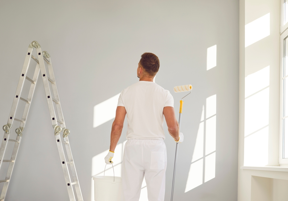
The Value of a Professional Paint Finish
At Proper Painting, we understand that color is only part of the equation. The quality of the finish matters just as much. A warm taupe can look flat and dull if applied incorrectly or with the wrong sheen. Meanwhile, that same shade can glow with warmth when applied professionally with the right technique and paint quality. A quality painter in Richboro, PA and throughout the state can diagnose and enact your vision with skill and precision.
Our experienced team helps homeowners navigate not only color choices, but also the subtle elements that take a paint job from basic to beautiful. We look at your lighting, your architecture, and even your furniture before making final recommendations.
Whether you want a soft matte for your bedroom or a more durable eggshell for the hallway, we tailor every paint job to suit your needs and lifestyle.
Rethink Your Neutral
The next time you’re tempted to reach for just another shade of white, pause for a moment. Ask yourself what feeling you want your space to give. Is it warmth? Calm? Sophistication? Your walls can deliver that and more when you lean into neutrals that are full of subtle character.
Avoid the white-out. Choose a better neutral. Let your walls do more than sit in the background. Let them quietly elevate your space with grace, depth, and quiet confidence.If you’re ready for a refresh and want guidance choosing the right shade for your space, we’d love to help. Contact Proper Painting today for a color consultation and let’s bring your walls to life.