Homeowners often wrestle with what colors and shades they want to utilize when painting or re-painting rooms within their living spaces. Some of the most common factors people consider throughout this process include how much natural light will be interacting with the given room or how the color fits in with the rest of the home’s layout. However, a consideration that finds itself being overlooked time and time again is the mood and atmosphere a selected color can provide a space. Color is not merely a visual choice; it is an emotional one. When you step into a room, your brain processes the hue of the walls before you even notice the furniture or the floor plan. This immediate sensory input can dictate whether you feel an instant sense of relief after a long day or a surge of energy to tackle a new project.
Discovering more about the benefits of supercharging the message you want your room to send is one of the ways to personalize your space beyond just the coloring of the walls. Interior painters in Doylestown, are well-versed in this arena, but it’s of value to homeowners as well. By taking a strategic approach to your palette, you can transform a static house into a dynamic home that supports your mental and emotional well-being. Below we’ll discuss the information you need to know to communicate silently through your home with color alone!
Take a Vested Interest in Color Psychology
Color psychology is fascinating in its own right, however, in the context of how it can be applied to interior painting it becomes even more so. The powerful psychological effect that color can have on people has been studied extensively. So much so, that certain emotions and feelings have become affixed to specific colors. Knowing which colors elicit a given emotion could influence your next painting decision. At Proper Painting LLC, we understand that the science of shade is just as important as the technique of application. Here are some common colors and the emotions that have been associated with them:
- Blue: Known for its calming effect, blue reduces stress and lowers blood pressure. It’s ideal for bedrooms, bathrooms, and spaces where you want to unwind. Lighter blues feel airy and open, while darker blues bring depth and coziness. Blue is often cited as the world’s favorite color because it reminds us of the sky and the sea, two of nature’s most vast and peaceful elements.
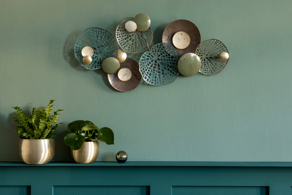
- Green: Reminiscent of all things natural and occurring, evokes the balance and peace of nature. Perfect for home offices (for focus), living rooms (for tranquility), and kitchens (for freshness). It also has the added benefit of being highly compatible with spaces that incorporate a great deal of natural lighting. Green sits in the middle of the color spectrum, making it the most restful color for the human eye to behold.
- Yellow: Yellow has long been labeled a color that you either love or hate. It’s usually associated with happiness and optimism, as it can lift moods and energize a room. However, too much yellow or a shade that’s too potent can be overbearing. Utilize softer yellows for kitchens or entryways. This can help invite your guests in with positive thoughts. Yellow captures the essence of sunshine, making it a powerful tool for brightening up windowless hallways or mudrooms.
- Red: Red is another hot-button color, lending itself to either love or scorn. It’s highly energizing, stimulating and can increase heart rate and appetite. Best used in dining rooms or social spaces, but typically as an accent. Because red is so physically stimulating, it can spark intense conversation, making it a “social” color that thrives in areas designed for gathering and activity.
- Purple: Typically donned by creatives and those who live in luxury. Lighter purples, like lilac and lavender, are soothing, thus making them ideal for bedrooms, while darker purples feel rich and dramatic. Historically, purple was the most expensive dye to produce, which is why it still carries an air of royalty and sophisticated mystery today.
- Neutrals and Darker Colors: Neutrals such as whites, grays, taupes, and beiges create balance and space. They’re perfect as a base for layering colors or for minimalist spaces that rely on texture. Darker colors such as navy, charcoal, or forest green add drama and sophistication. These are best utilized in cozy studies, moody bedrooms, or elegant dining rooms. Proper Painting LLC often suggests neutrals for homeowners who want to let their colorful artwork or vibrant furniture take center stage.
Match the Mood to the Room’s Purpose
It seems like it should go without saying, however, sometimes we fall in love with a color so deeply without truly diagnosing if it’s right for the room we want to use it in. For example, you wouldn’t want to drape an office in an aggressive or distracting shade of red. This can inspire feelings of anger, dread and overall frustration which will no doubt take its toll on your efficiency. Softer shades here will pair much better with your creative aspirations and will lead to a lighter, airy thinking space. The goal is to align the “energy” of the color with the “task” of the room. If the room is for sleeping, the color should be a lullaby; if the room is for working, the color should be a cup of coffee.
On the other hand, you wouldn’t want to opt for a color that’s too gentle, say a shade of blue for example. This could effectively keep you from accruing stress during your work day but it can also promote unproductivity in a different sense. Too soft of a blue can contribute to feelings of tiredness, inactivity and excessive comfort when your mind needs to be engaged. It’s a delicate balance that goes hand-in-hand with your understanding of color psychology. Once you become adept in these conditions, painting in Warrington will never be easier. Proper Painting LLC takes the time to discuss your daily habits within a room to recommend a palette that complements your lifestyle.
Remain Aware of the Power of Light
Both natural and artificial lighting should be strongly factored in when you ultimately decide upon a color for your new office or bathroom. Natural lighting can greatly affect the timbre of both North and South-facing rooms. North-facing rooms tend to feel cooler and deeper and warmer undertones should be used to counteract this frigidity. South-facing rooms receive warmer undertones and again you want to provide the yin to the yang here as cool tones can help balance the brightness. A common mistake is picking a color based on a small swatch in a brightly lit store, only to find it looks muddy and dark in a room with small windows. Light is the medium through which we see color, so the two can never be separated.
Furthermore, artificial lighting such as LED, incandescent, or halogen bulbs can drastically shift a color’s appearance. An “eggshell” white might look crisp and clean under daylight but turn a sickly yellow under old-fashioned warm bulbs. Proper Painting LLC advocates for testing large samples on multiple walls to see how the shadows and light sources interact with the pigment throughout the morning, noon, and night. This thorough testing process makes certain that your final choice remains beautiful regardless of the time of day.
The Professional Advantage
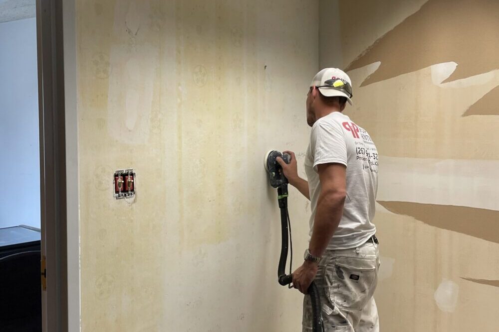
While the theory of color is something any homeowner can study, the application of that color is where the true challenge lies. Professional painting is about more than just moving a brush; it is about precision, surface integrity, and durability. When you choose to invest in your home’s atmosphere, you want a finish that is free of streaks, drips, and uneven patches. A professional team brings specialized equipment, such as high-volume low-pressure sprayers and precision edging tools, to achieve a factory-smooth finish that a DIY project simply cannot replicate. Moreover, the preparation work, sanding, caulking, and priming is what makes certain the color stays vibrant for years to come.
At Proper Painting LLC, we treat every wall as a canvas. We understand that we aren’t just applying a liquid coating; we are helping you build an environment. Our team respects your property, using heavy-duty drop cloths and precision masking to protect your flooring and furniture. We also stay updated on the latest eco-friendly, low-VOC paint technologies, allowing you to enjoy your newly colored room without the harsh chemical smells typically associated with fresh paint. This commitment to quality and health is a cornerstone of our service.
Conclusion
These are just some of the many facets that should be considered when contemplating what mood you want to establish with your next coat of paint. Paying attention to things like color psychology, the uses of a given space and the effect lighting can have on our perception of a room’s feel can help bring a living, breathing aura to your home. Your home should be a reflection of your personality and a sanctuary from the outside world. By choosing colors that resonate with your spirit, you create a space that truly welcomes you back at the end of every day.
In any case, if you have any further questions about how to properly consider or balance colors, you should consult the professionals at Proper Painting LLC. They combine years of experience and their dedication to their customers that can’t be matched. If you want to discuss a given color or would like an expert to do the painting, get in touch with us today. We’d love to hear from you!
Blog Updated February 9, 2026